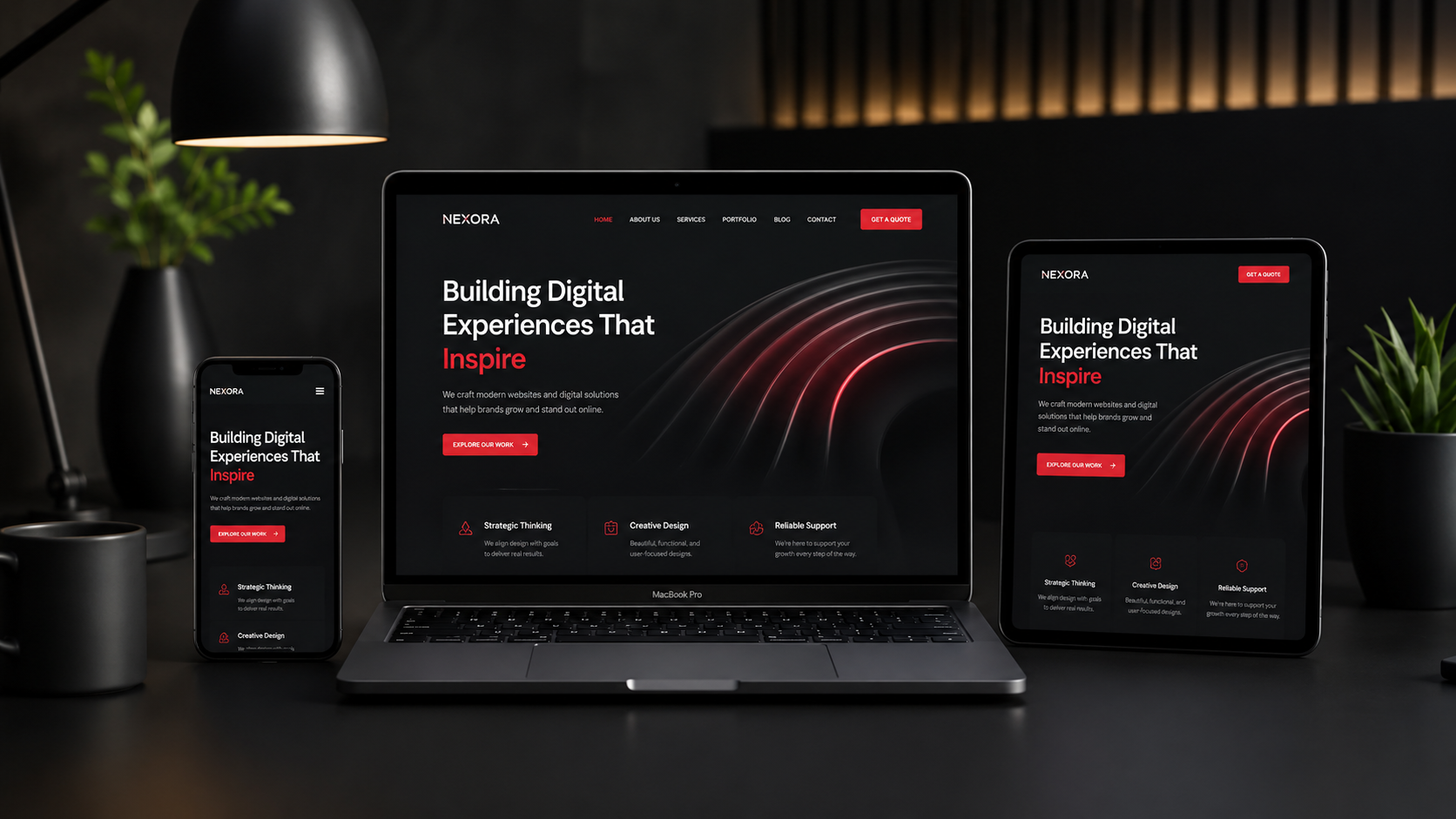
Responsive design in 2026 is not a desktop layout that simply shrinks. It is a content and component system that adapts to space, input method, language and user preferences while keeping the main task understandable. A “perfect” experience is not one fixed appearance; it is resilience across realistic conditions.
Design for content and constraints, not device lists
Test breakpoints created by the content itself, including a long Arabic heading, text zoom and a narrow landscape viewport rather than a few fashionable phone sizes. Start with the user problem and the task that must be completed, then turn that evidence into clear journeys before choosing visual effects. Combine customer questions, support notes and analytics, and map the path from the first visit to the meaningful action. A simple prototype exposes confusion early and prevents expensive polishing of an interface that does not help people decide.
Make components responsive, not only pages
Flexible grids and container-aware elements let a card or form respond to its actual space within a layout instead of relying only on the screen width. Build the experience from reusable components, a logical heading structure, visible focus states, sufficient contrast and keyboard-friendly navigation. Test Arabic right-to-left layouts as well as English and French on real screens. Important copy and links should not depend entirely on client-side JavaScript. Accessibility works best as a design and engineering requirement, not a final compliance pass.
Respect touch, keyboard and motion preferences
Provide comfortable targets and a logical focus order, reduce motion when requested, and never make hover the only way to reveal important meaning. Measure performance on real templates rather than checking only the homepage. Compress images, declare their dimensions, reduce unnecessary scripts and reserve space for late content. Core Web Vitals are useful when combined with field data, user behaviour and error reports; a good laboratory score alone does not prove that every visitor receives a fast, stable experience.
Observe speed and stability across templates
Do not let mobile images or dynamic menus shift the layout after interaction begins, and test slow article, service and form templates rather than only the best page. Release changes in a controlled scope and choose a measure connected to the page purpose: form completion, a qualified conversation, service exploration or checkout completion. Compare before and after data alongside accessibility and performance checks. Record decisions and evidence so future contributors understand why a component changed and do not restore patterns that already caused friction.
Mistakes to avoid
- Copying a visual trend without a user purpose.
- Testing one desktop size while ignoring mobile and languages.
- Measuring aesthetics or traffic without task completion.
Practical implementation checklist
- Test text at 200% zoom.
- Use keyboard and touch navigation.
- Review RTL component behaviour.
- Prevent unintended horizontal scrolling.
- Measure article, service and form templates.
Frequently asked questions
How do we know whether a design works?
It works when the intended audience understands the offer and completes the task with little friction while performance and accessibility remain sound. Combine usage data with short user conversations.
Does the whole website need to be rebuilt?
Not always. Start with the highest-impact templates, fix measurable barriers and expand the design system only when evidence and maintenance needs justify it.
Trusted references
Next step
For a practical review of experience and performance, explore FoxDigia services and share the real pages and business goals so the scope can be defined responsibly. Explore services · Contact us
FoxDigia Team
FoxDigia Team specializes in building brand identities, website design, digital marketing, and improving businesses' presence in Morocco and the Gulf.